Delving Into Typography and Labeling
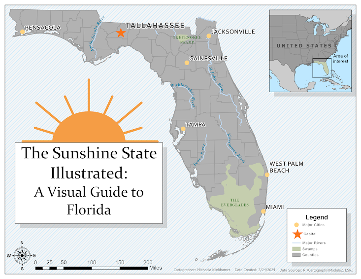
The recent lab took us on an insightful journey into mapmaking, focusing on Florida. The project highlighted typography's role in enhancing maps far beyond simple geographic representation, merging geography with the art of cartography to emphasize informative design.
Objective
Our task involved labeling Florida's map to include cities, rivers, and natural landmarks, adhering to typographic principles. Using ArcGIS Pro, we delved into computer cartography, prioritizing map design essentials and text placement to boost readability. The outcome was a Florida map pinpointing critical locations and distinguishing feature types with unique labels. The lesson instructions gave insight into which fonts are selected and why, such as serif font for natural features and sans serif for cultural. Before this class I didn't know the difference between the two typeface categories, but Serif typefaces have "little feet" that extend of the letters while sans Serif is without the feetsies (hence "Sans" that means without in latin). Moreover, the instructions explained that river labels are in italics to suggest fluidity and bold city names easily drew attention.
Creation Process
We navigated through ArcGIS Pro, starting with label class setup and adjusting text properties to mirror the mapped features' essence. This task taught us to adjust text size, color, and style, distinguishing natural from cultural features and enhancing the map's utility and aesthetics.
Customizations
I made several customizations in my map. One of them is that I increased the size of both the symbols and label fonts for my map since it was rather limited in data. The labels for the cities looked very small in the map since we only selected a few. Another customization I used was I changed the color scheme to reflect the “Sunshine State” (basically just used orange, blue, and green). Lastly, I changed the font for the cities because the lecture had suggested using sans serif font for infrastructure and made sure that the rivers and swamps were in serif font for a better readability between the different features. Other than the previously mentioned customizations, I also added an inset map of the United States and experimented with the backgrounds of the map frames until I made a map that looked aesthetically pleasing to me. Overall, I just wanted a "tourist-y" map of Florida.


Comments
Post a Comment