GIS 5007L - Computer Cartography - M1 Lab : Map Critique
The Cartographic Journey
Delving into the realm of cartography, we find a world where art meets science, crafting a medium that efficiently conveys information. Maps do more than show routes; they serve as a canvas for complex data, presented in a way that speaks clearly to its viewers. The design of a map is a powerful factor in its utility and its ability to leave an imprint on those who use it. Our latest lesson delved into this interplay, dissecting maps to find the harmony between visual appeal and the conveyance of information.
Southport Bicycle Map: The Intersection of Charm and Function
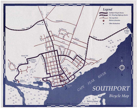
Consider the Southport Bicycle Map—a paragon of cartographic elegance. Its mission? To deftly navigate cyclists through the charming byways and picturesque vistas of Southport. Achieving this, the map marries simplicity with sophistication, balancing practicality with the quaint allure of a seaside town. The map's strengths lie in its clear focus on the cyclists' pathways. Solid and dashed lines mark the terrain, while landmarks are signposted with symbols that speak without words. A monochrome palette sidesteps visual chaos, ensuring a tranquil journey for the eyes.
The map’s aesthetic draws us in threefold:
- Its nostalgic hues cut through the clutter to clarify and charm.
- The chosen typography marries legibility with design, creating a seamless visual dialogue.
- The map’s balanced spacing and thoughtful alignment cultivate harmony, inviting the viewer to discover new routes.
NOAA's Oil Spill Map: A Muddled Spectrum Calls for Refinement
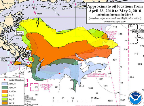
In stark contrast, the NOAA Oil Spill Map, tasked with charting an oil spill's progression, stumbles in clarity and function. The overlapping hues, meant to represent the passage of days, blend into ambiguity. In short, it simply displays the data without regard for importance, meaning the viewer isn't quite sure where to focus their attention. The title may indicate that the map aims to show the forecasted oil spill, but this information is lost as everything around it seems to scream for attention.
Here’s where it falters—and my proposed remedies:
- Introducing a color scheme with distinct contrasts will sharply delineate the days. For example, less important days may be gray or more translucent to draw attention to the forecast.
- By streamlining the visual data and incorporating insets, the map's story can breathe, uncluttered. In other words, there's a lot of information that is not relevant, like the numbers cluttering the ocean and the pink text fighting for attention, that should be removed from the map.
- By bolstering text size and spacing, we design a map that’s informative and accessible. The text that is important should be easily read and not obstruct any of the visual data.


Comments
Post a Comment