Module 4: Color Concepts & Choropleth Mapping
Creating Meaningful Color Ramps
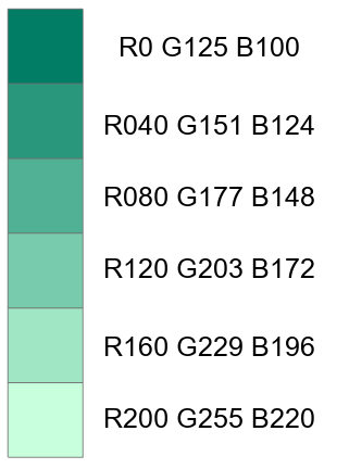
Linear Progression
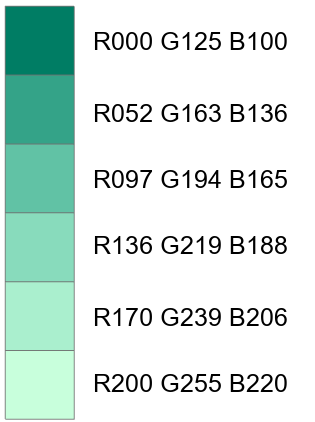
Adjusted progression
ColorBrew
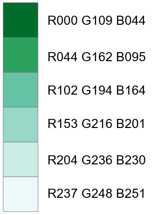
Comparing the three color ramps reveals distinct approaches to color progression in data visualization. The linear progression maintains mathematically consistent steps (~53.4 units each). However, it does not account for human perception, while the adjusted progression attempts to improve this by decreasing step sizes from ~73.8 to ~36.8 units as values get lighter, acknowledging increased human sensitivity to changes in lighter values. ColorBrewer's progression demonstrates the most sophisticated approach, with carefully calibrated non-linear steps that start large (~85.7 units), peak in the second step (~95.7 units), and then gradually decrease (~41 units), creating a perceptually balanced sequence that best accounts for both human vision characteristics and practical visualization needs.
Mapping Change Using Choropleth Mapping

Based on the histogram's distribution, Natural Breaks with 6 classes would be the best classification choice for this data. Natural Breaks effectively captures these natural divisions in the data while maintaining meaningful class breaks. This classification will highlight the areas of significant population decline and growth while also showing the more subtle variations in the middle range. The six classes allow us to see the full spectrum of change without oversimplifying or overcomplicating the visualization.
The natural groupings in the histogram suggest that fewer classes would obscure important patterns while more classes would create artificial divisions that don't reflect the actual data distribution.
Comments
Post a Comment